Part One.

Project 3. Surface and Depth.

Brief

Read the review by Campany and Colberg and, if you haven’t already done so, use them to begin the research section of your learning log. Try to pick out the key points made by each writer.

My Response

Joerg Colberg. Review: jpegs by Thomas Ruff. [1]

In this article, Colberg expresses his appreciation for Ruffs jpegs. He says “As a book, everything works just beautifully”.

He starts by stating that many people will probably “deny that most of Ruffs recent work is actually photography”. That seems to be a discussion for another time as he says of those debates “there is no need to get in to them here”.

Colberg obviously appreciates these more in book form rather than in a gallery, after stating “Ruffs jpegs work amazingly well in book form” and that he “thought that the amount of detail in the images was actually not large enough to justify the sizes shown in the gallery”. Perhaps the size took away from being able to just look and appreciate what the image shows. Ruff / the Zwirner gallery obviously thought there was a point to showing these images as “gigantic prints”.

Colberg describes there being “so many attempts to convince me that in reality “jpegs” is more” and that he still hadn’t figured out what “more” really meant. If a photo is just a photo and it is just beautiful, that is all it needs. However, when there is little obvious concept and someone tells you there is more, but it isn’t obvious or at least explained, how does the viewer truly know. Perhaps the point of the jpegs was to make people question? If there is no obvious answer, perhaps you form your own concept and that makes it personal to every individual who sees the images. Or perhaps there is a concept which not all will understand.

From this, I would take away that although Colberg likes the series of jpegs from Ruff, he doesn’t feel there’s a concept behind them, saying there’s an “ultimate thinness of the concept behind it” and therefore is looking for meaning or purpose. If there is no concept behind the photos or the way they are produced, that makes it difficult to appreciate them in their entirety as you cannot fully understand the meaning or motive. Although you can appreciate them for what they are and how they look, whatever form they may be in.

David Campany. Thomas Ruff: Aesthetic of the pixel. [2]

Campany explains how Ruff uses other people’s work stating that “in fact, Ruff tells us they are from the internet” meaning these images have been re worked. He doesn’t seem to give a personal feeling towards the collection. Never really stating out right that they do / do not work.

He debates who the archives belong to. Saying “what does it mean to say an image is ‘from the internet’? Is the internet an archive?” and that “Ruff’s JPEGs belong to at least three archives: his own, the internet, and the specific archives accessed online”.

He moves on to explain the pixel, saying “The pixel has replaced the grain of photographic film”. He explains how grain was seen to show “authenticity” in a photographer’s work, with an example of picture from the D-Day landings, explaining how it was seen to show the “kind of limit to which the photographer and the equipment had been pushed”. I can see why it would have been viewed this way. In such a hostile situation, where “urgency” and “extreme human endurance” were seen, the “haziness” brings a sense of reality to the photos. A little inkling of how they must have felt, the wobble they might have had. With that, the haziness and grain add to the purpose and the feel of the images.

Moving from that to say that “Pixels are quite different” perhaps shows Campany doesn’t have the same appreciation for the jpegs as he does for the D-Day landings works, by Robert Capa, with grain, even if they were “the result of hasty processing by an assistant”.

Campany describes pixels as a “cold technological limit” and at the start of the article describes Ruffs work as “cold and dispassionate”. However, he then calls it “surprisingly beautiful”. And goes on to end the article stating “The result is a great tension or drama”.

I think this article is balanced and seems to give points from both sides without personal judgement, unlike Colbergs article which described how he personally felt about the jpegs.

References

[2] Campany, D. (2008). Thomas Ruff: Aesthetic of the Pixel At: https://davidcampany.com/thomas-ruff-the-aesthetics-of-the-pixel/ (Accessed 24/04/21).

[1] Colberg, J. (2009). Review: jpegs by Thomas Ruff At: http://jmcolberg.com/weblog/2009/04/review_jpegs_by_thomas_ruff/ (Accessed 24/04/21).

Project 2. Exercise 1.4 Frame

“The final exercise of this project makes use of the viewfinder grid display of a digital camera. This function projects a grid on to the viewfinder screen to help align vertical and horizontal lines, such as the horizon or the edge of a building, with the edge of the frame.”

“Take a good number of shots, composing each shot within a single section of the viewfinder grid. Don’t bother about the rest of the frame!”

For this Exercise, I took inspiration for my parents garden… Which then extended to a walk around their block. As it was quite a sunny day, there were photos I needed to take again to not get my own or my moms shadow in. Also to avoid the dog walking in and out of frame!

Exercise 1.4 Frame.

For the frame above, I tried to capture photos in all parts of the grid. I have then put these in to the corresponding grid squares within the frame.

It felt like a more natural photo to take when the subject was in the side of the frame rather than the middle. I have read about the rule of thirds before and find myself looking at that when I take photos now.

It was hard to find a subject to photo in the top or bottom of the middle grid column. Compositionally, this just doesn’t work for me. The object looks completely out of place and doesn’t hold the eye, as it does when the focus is over to a side.

Little red flowers.

When the subject is in one of four corners, I don’t feel that holds enough strength within the frame and I then start looking for something else within the picture. However, if the object is over 2 of the far side grids, it sits much better and has a much more pleasing result.

Drooping Tree.

From the photos I have used for my Frame, I think the better one is below. I like the contrast in colour of the flowers against the bland, brown fence. The bit of grass provides a little more colour across the frame and the red of the petals pops to draw your attention to that first.

If I were to take this photo again, I would probably take it from nearer to the flowers. I would try to get just the red flowers and avoid the yellow, and just fence in the background to give a total contrast in colour. a little like the cropped version below but I would take from a different angle too, so as not to cut off parts of the flowers.

Project 2. Visual Skills. Exercise 1.2 Point.

A point is the smallest graphical element, if you join many points together you make a line. In mathematics, a point doesn’t have any weight at all, it indicates a place. So compositionally, a point has to be small within the frame and its position is generally more important than its form.

Take three or four photographs in which a single point is placed in different parts of the frame. When composing the shots use these three rules: the place of the point shouldn’t be too obvious (such as right in the middle), the composition should hold a tension and be balanced (the golden section or rule of thirds) and the point should be easy to see. Evaluate the shots according to these rules and select which one you think works best.

Then take a few more shots without any rules, just being aware of the relationship of the point of frame. Without the rules, how can you evaluate the shots?

I have posted about this exercise in my learning log. I attempted this project twice and did not feel I met the brief either time. Therefore I tried again.

1. I find in this photo my eye is not drawn to the point. The photo would make as much/as little sense with or without it.
2. I think the composition of the point in this photo sits better than the one above. I sat the point on the corner of the bottom grid in this photo. I feel like it has more purpose within this photo and yet is just another element within the frame.
3. As with the photo above, I place the point on a corner of the bottom grid line. again I think this works well. I think this works better than the first photo, as it doesn’t sit in the same line as the 2 pots behind. This seems to give a better placement perhaps as it seems to sit a bit more alone within the frame but still not in an obvious position making it the focus.
4. Within this frame, the point is too close to the camera. It becomes what you are immediately drawn to before taking in another beyond that. I don’t think that is the purpose, as the brief states “a point doesn’t have any weight at all, it indicates a place”.
5. I don’t think this works as well as photo 3. Although the point still does not sit in front of the 2 pots, it still feels too close. I think this may be because the spout is almost “touching” the pot within the frame. I don’t feel there’s enough separation between the two things. But I still think this works better than photos 1 or 4.

“the composition should hold a tension and be balanced (the golden section or rule of thirds) and the point should be easy to see”.

Without following any rules it’s hard to evaluate shots, as there is no definite point to them. Although they could become a “nice photo”, it’s hard to evaluate whether the composition works as there is nothing purposefully done, to draw the eye or create a point.

Project 2 Visual Skills, Exercise 1.3 Line

“Take a number of shots to create a sense of depth. Shooting with a wide- angle lens strengthens a diagonal line by giving it more length within the frame. The effect is dramatically accentuated if you choose a viewpoint close to the line.”

For this exercise, I did a little research in to Eugene Atget, as he was referenced in the project. Atget was a French documentary photographer. He photographed Paris as the landscape changed through modernisation. According to www.vam.ac.uk , “Atget was driven by the disappearance of buildings as schemes of modernisation swept the city. Ignoring the grand new vistas, he set out to record the character and details of the timeworn streets.” ( www.vam.ac.uk/content/articles/e/eugene-atget/ )


Chemin à AbbevilleE

Above is an example of Atget’s work. When I looked back at my photos for this exercise, the photo above reminded my photo below:

They’re similar in what is within the frame. Both show a pathway obviously made by footprints of all kinds of animal, which are both used so much that the hard ground has turned to mud and most traces of green life have been walked off. In the distance of Atgets image, there is what looks like a horse? Although not photographed, there were horses on the path I walked. Both have a pathway which leads your eye through the photo.

I took my camera when I went for a walk (in a rare bit of sun) down an old railway path. The trees, bridges and obvious pathway gave great inspiration for this project as it’s all about lines. Some photos show obvious lines, such as steps, and bridges. Others show less obvious leading lines, from the trees and the pathway. The graffiti added a bright bit of colour against the subtle tones of a rural walk.

Tree line and pathway draw the eye through the photo, creating a sense of depth within the frame.
I find myself first drawn to the iron of the bridge, then the colour of the graffiti and then down the pathway. I like that this photo lets the eye explore and almost feels like there is more to discover the more you look in to it.
The treeline here gives an obvious route for the eye in to the frame before coming back to look at the foreground.

I then took my camera to work with me. After spotting a photo opportunity whilst I was without my camera, I took some photos on my phone to see if it would work for what I was trying to capture. You can find the link to those photos here. Unfortunately when I went back (twice) with my camera, the was no water leaking from the above level of the multi storey car park – perhaps not so unfortunate for the company who own the car park!

I don’t think this image worked as well as I thought it would. although the image shows perspective, I don’t think its necessarily “nice”
I think this works better than the image before. there are more pillars within the frame which seems to work better and gives more to look at. Although setting at a wider angle shows more of the ceiling than I would like.
I think this photo works best out of these 4 due to the line of light on the ceiling giving an obvious trail to follow.
I like the line of lights in this photo coming from the corner of the shot. Something about this doesn’t “work” for me but I’m struggling to pin point what. Perhaps the glare on the right side is just off putting.

Although I think these images work well, I set my camera to auto as asked and find they’re a little blurry. Perhaps I had not set the focus to auto.

Below are photos of the same scene, but later in the day when I was leaving work.

I think this works well with the view point being close to the lens, but for me, the spillages on the ground take over the photo. Maybe that’s a good thing to show off the purpose of this area, it is a car park after all.
Again I think this works better with the pillar being close. I like the use of tape around the pipe, it shows a kind of comedic element of fixing anything with gaffa tape… including car parks apparently. I think this would work better if the pillar had been placed differently rather than in the middle.
I think this works well to show perspective. I like that there’s a line to follow going away from the viewer and then there’s a horizontal line to follow when your eye reaches the back of the photo, creating that sense of depth within the frame.

“take a number of shots using lines to flatten the pictorial space. to avoid the effects of perspective, the sensor/film plane should be parallel to the subject”.

Radiator. I was looking for lines within my house which would flatten the space. I think this works well for that purpose, but is also really boring. With some editing, I think this could become quite an interesting photo if the shadows were darkened.
Staircase. After losing inspiration in my own home, I went to my parents’. I think the beam, light wood and wall make a good textural photo- 3 different materials within the frame, and show little depth due to where the photo was taken from. Again though, it isn’t a very interesting shot.
Rubble. I found this interesting because of the pipe at each end of the concrete, how these things have lived within / around each other and have now been broken down for the next build. this photo was taken from above, and gives a lot of lines. It also does not give any depth. My eye is firstly drawn to the wood, then the pipe, then the rubble.
I think this works well for flattening the image. I am first drawn to the brick wall and then the slabs, and then to the item sat on top. I think this photo captures the point of the exercise.
Although I like this image – and it isn’t something I feel I’ve photographed before, so it’s nice to see a different kind of image in my photos- I think the slither of grass between the wall and the building behind take away from flattening of the photo. If I had take the photo from a slightly lower point, that would of been avoided, but on the cameras screen, unfortunately I didn’t notice that at the time.
Gate. I liked the lines within this gate and that was my main reason for taking the photo, whilst looking for oppurtunities to photograph something for this exercise. I think the lack of background takes away from this photo. If there had been sky behind, it would of enhanced the sense of the image… but that was not an option and there were only bushes.
Under the bridge. I really like this image. I find myself hoping to find places to take industrial, architectural style photos. I like the line leading in to the bottom right corner but that may give a slight feel of perspective as it possibly draws you in to the photo.
Bridge. I think the clear sky beyond the bridge helps to take away any perspective from this. There is no depth within the frame.
Path.

The bottom 3 photos here are my favourite for this exercise. They all have an industrial feel and although they’re interesting, they don’t draw you in to the frame as there is no where to go within it. I think these work to flatten the space. they were taken on the locks in Wombourne.

“Review your shots from both arts of exercise 1.3. How do the different lines relate to the frame?”

Within the first set of images, the purpose of the lines is to draw you in to the frame. To pull you in to the image. To make you feel like it is part of the real world which you can sense the depth of.

In the second set of images, the purpose of the lines is to flatten a frame. t take awy all sense of depth. Allowing you to look at the shapes, the lines, the lighting, without being pulled within the frame. You look at the image rather than in to it.

I really enjoyed this exercise, other than thinking constantly where I could find lines to flatten the image. I was thinking too literally. Once I was out and taking photos for it, just attempting and figuring out my mistake, it became easier.

Project 1, Exercise 1.1 The Instrument

Brief

“Take three or four exposures of the same scene. Don’t change anything on the camera and keep the framing the same.”

ISO 500, 1/80, f5.6 – 20-02-19, 17:42:18
ISO 400, 1/80, f5.6 – 20-02-19, 17:42:18
ISO 500, 1/80, f5.6 – 20-02-19, 17:42:19
ISO 500, 1/80, f5.6 – 20-02-19, 17:42:20

After setting the camera to Auto, I took 4 photos from my garden. There was very little wind and the sun was going down. The photos don’t seem to be any different, although the camera changed the ISO for one of the four photos, the other three stayed the same throughout. I would assume the difference in shots would be due to the shots being taken hand held and therefore there would be slight movement.

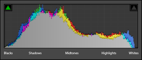
*EDIT. Looking at the histograms, there are slight differences between each photo. So, although the actual photo may not look too different, the histograms show there are slight differences.

Histograms are not something I have looked at before, for that reason I’ve done some quick research to learn the basics. According to https://photographylife.com/understanding-histograms-in-photography , “many beginner photographers don’t seem to understand what they show”. For that reason, I think it’s important I look in to it again as I still don’t really know what I’m looking at. Below is an example from the same website address above.

How to Understand Histogram

A histogram shows the exposure of a photograph. The left side shows Black (darker) to the right, which shows white (lighter). This shows shadows and highlights. The histogram is a count of how many pixels are at each level in between. My camera show a red, green and blue histogram too. These are the primary colours and are known as the RGB histograms. These represent the distribution of colours in a photograph.

The histograms for my photographs seems to be over to the left more so than the right. This is probably because of the darkness of the branches and the tree line across the bottom of the photo. The blue shows more towards the right, probably because the sky is the lighter part of the photo and is the colour most seen in the image.*